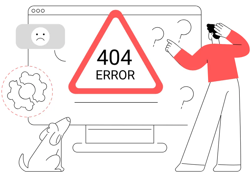
In my spare time I help out on the StudioPress forums. One of the most asked questions is ‘how do I get my header to be responsive?‘. The issue is usually with the header logo and getting it to show properly on different screen sizes.
I’m going to show you what I think is the best way to handle your mobile responsive header logo. I use it on most websites that I develop. Not only does it make it so much easier to handle responsive scaling, but I think it’s also more appropriate to have your logo inline. There’s also a bonus in this code that fixes a Genesis bug with the SEO title.
Replacing the Genesis Background Logo With An Inline Logo
Your logo is an important part of your brand and your website. It’s usually the first thing visitors see when they visit your website. It’s not just used for decoration but it’s important content, which makes an inline image more appropriate for the job.
From a development point of view the biggest advantage is an inline image will automatically scale, making it much easier to ensure your logo looks great on any device and screen size.
What’s The Issue With Background Images Being Responsive?
Background images are just as the name implies, they sit in the background and are not seen as content. So if you have a container for your header (such as <div class=”site-title></div>) with only a background image applied using CSS, that div container is empty.
As you shrink your screen size, and your container <div> shrinks along with it, what happens to the background image? Nothing happens because the background image is still in the background, and the size is not affected at all by the container div.
The blue box below is an empty div that has a background image applied using CSS (a special thanks to our model, Matsuhiro). The box size is 350px by 250px and contains no content.
If we change the size of the box to 200px by 100px, you’ll see that the background images does not change size along with it, so a lot of Matsuhiro gets cut off.
There is a CSS property that you can use, background-size: contain, which will “contain” the image inside of the container. It’s not supported in Internet Explorer 8, and you’ll still have to add CSS rules to control the size of your container making it more difficult to adjust as you view it on various screen sizes.
A Better Genesis Mobile Responsive Header Logo
A better way to handle your Genesis header logo is to place it inline. Doing so will allow your header to scale automatically and make it much easier for you to have a mobile responsive header.
[gist id=”ff981e5e02ae015fa2a2″ file=”genesis-inline-header-logo.php”]
Add this code to your theme’s functions.php file, making the following changes:
- Change /images/ab-logo-rd-80.png” width=”155″ height=”80″ to match your image path and dimensions
- Change “abte” to match your unique theme preference
You may still have to adjust your CSS for various screen sizes, but you’ll see it’s much easier to get your responsive logo using this method.
Bonus – A Genesis Bug Fix When Using A Static Home Page and Blog Page
There’s a bug with Genesis when using a static home page and blog page. In your WordPress admin panel, you have the option to assign a specific page for your home and blog pages (under Settings > Reading):
With this setup, you’ll notice that your home page logo is now wrapped in <p></p>, NOT <h1></h1> tags as it should be. Your Blog page will now be wrapped in <h1></h1> tags, but should be in <p></p> tags.
Using the code above, I replaced the $wrap conditional “is_home” with “is_front_page” to correctly add the markup. After making these changes, your home page logo is now wrapped in <h1></h1> and your blog page logo is now correctly wrapped in <p></p> tags.
Final Thoughts
This function will make your work much easier when styling your responsive logo. The only potential drawbacks are that you’ll have to manually edit your code to make this change, and your theme logo settings will no longer work.
I have considered making this into a plugin that allows you to make these changes from the admin panel. Sign up for our Newsletter and you’ll be the first to know if that happens:
Roberto Porcar says
Why this entry does not have many big THANKS? GREAT tutorial.
Tony Eppright says
Thanks Roberto! Glad you found it helpful!!!
Neil Gee says
Thanks Tony, used this today, works great, I had to add in some CSS rules to hide the site-description which if set will show when this is used
Tony Eppright says
Hi @Neil_Gee:disqus…glad it was useful! Thanks for letting me know about that. I will update the article to include that, and a couple other minor things as well.
Eva says
Hi Tony, thanks for the tutorial,it really works great!!
I only wonder why my logo looks a bit blurry (the file is ok) as it didn’t was like that before… The site is still in test phase, maybe I can send you a link?
Thanks
Tony Eppright says
Hi Eva, glad it worked for you! I’m not sure what would cause your logo to look blurry unless it’s smaller than the sizes entered in your CSS. That would cause your logo to be upscaled, which would explain the distortion/blurriness.
I actually have some improvements to add to this article which should help, but one thing I’ve started doing it make the logo twice the resolution, then using CSS to set the max-width…that way it looks great on Retina devices also.
If you’d like to send me the link, please use my contact form and I’ll be happy to take a look.
Eva says
Thanks Tony, I will send you a link!
Tony Eppright says
Thanks Eva…got your message and replied.
Eva says
Got it, thanks a lot! I’ll let you know if it works.
Henk Povee says
Alas Tony, it does not seem to work in my site. In the source code of the page I can see the logo.png is loaded, but it does not show, just the old background-img. Where did I go wrong? I’ll send the link if you want. Thanks for your answer.
Tony Eppright says
Hi @henkpovee:disqus…sorry you’re having troubles. If you’d like to send the link, please do through my contact form and I’ll take a look.
I’m pretty sure I know the issue, though. One of my readers reminded me that you have to remove the “text-indent: -9999px;” from the “.site-title” in your theme’s style.css.
You may also have to add “background: transparent !important;” to your .site-title a (this may vary by theme).
I’m sorry I haven’t had the chance to update the article…I will do that shortly, but hopefully this will help you get it sorted.
Henk Povee says
Hi Tony,
Thanks for replying that quick.
In the meantime I couldn’t help experimenting a bit further and finally solved the problem.
I too stumbled upon the text-indent: -9999px;, which indeed takes the img completely out of sight, although it‘s still there.
However, in my Genesis setup on localhost (for experimentation) exactly the same style.css and functions.php as in the working site didn’t produce the problem.
Your code just worked allright. That puzzled me even more! What could be different?
At last I found it: in Genesis Theme Settings you have to turn ‘use logo’ off and instead choose ‘dynamic text’. Sounds not logical, but that did it!
It’s also a good idea to set .site-header to a ‘min-height’ , 100 px or something, to keep the header space proportional to the img height, when viewed on a mobile screen.
Well, I hope you will find the time to update the post, because your method is in itself the easiest I have seen so far. Thanks!
Regards,
Henk
Van: Disqus [mailto:[email protected]]
Verzonden: woensdag 17 juni 2015 21:06
Aan: [email protected]
Onderwerp: Re: Comment on A Better Genesis Responsive Logo With An Additional Bonus
“Hi @Henk Povee…sorry you’re having troubles. If you’d like to send the link, please do through my contact form and I’ll take a look. I’m pretty sure I know the issue, though. One of my readers reminded me that you have to remove the “text-indent: -9999px;” from the “.site-title” in your theme’s style.css. You may also have to add “background: transparent !important;” to your .site-title a (this may vary by theme). I’m sorry I haven’t had the chance to update the article…I will do that shortly, but hopefully this will help you get it sorted.”
Settings
A new comment was posted on AlphaBlossom
_____
Tony Eppright
Hi Henk Povee…sorry you’re having troubles. If you’d like to send the link, please do through my contact form and I’ll take a look.
I’m pretty sure I know the issue, though. One of my readers reminded me that you have to remove the “text-indent: -9999px;” from the “.site-title” in your theme’s style.css.
You may also have to add “background: transparent !important;” to your .site-title a (this may vary by theme).
I’m sorry I haven’t had the chance to update the article…I will do that shortly, but hopefully this will help you get it sorted. 3:05 p.m., Wednesday June 17 | Other comments by Tony Eppright
Reply to Tony Eppright
Tony Eppright’s comment is in reply to Henk Povee:
Alas Tony, it does not seem to work in my site. In the source code of the page I can see the logo.png is … Read more
_____
You’re receiving this message because you’re signed up to receive notifications about replies to henkpovee.
You can unsubscribe from emails about replies to henkpovee by replying to this email with “unsubscribe” or reduce the rate with which these emails are sent by adjusting your notification settings.
Tony Eppright says
Thanks for posting that…it will be helpful to our readers. I will also update this article with this info as soon as I have some time to test a few different things out, but glad it was helpful and that you got it working the way you wanted.
Eva says
Hi Tony, a while ago I posted a small issue. That has been resolved now, and it really works fine. Just one thing. I uploaded the
image again, twice the resolution as you recommended. But on iPad – Landscape the logo
suddenly gets quite small. Any idea why that happens?
Thanks!
Eva
Tony Eppright says
Hi Eva! I took a look and there is a media query for max-width: 1139px. Inside of that media query your .title-area is set to 300px wide. You’ll have to change that to a larger number, or I would probably use percentages instead.
When it gets to 1023px, (max-width: 1023px) it changes to 100% width, that’s why it gets larger again.
Take a look and let me know if you have any issues with that.
Eva says
Hi Tony,
Thanks a lot! You pointed me to an easier solution: setting the header to full size (no sidebar). That’s what we wanted anyhow. So, now it works fine on all devices and shows a big header on a desktop 🙂
Thanks again for your fast reply,
Eva
Tony Eppright says
Hi Eva,
I’m so happy to hear it’s taken care of now and working the way you want!
Glad I could help 🙂
Celeste says
I bet this is a noob question: in your tutorial you say “Change “abte” to match your unique them preference”. I assume you mean “theme” not “them”, but I don’t know what I’m supposed to change. I’m using a StudioPress Theme, Modern Portfolio Pro.
Thanks for any help!
Tony Eppright says
Hi @disqus_7IwEzl9xDR:disqus. Thanks for letting me know about the typo, fixed.
It’s best practice to add a unique identifier to your function name so that it reduces the chance of a conflict from another plugin.
If you have 2 functions with the same name, you’ll get an error so to reduce the chances of that happening, you should add a unique prefix. It can be whatever you want…the thinking is there’s much less chance of someone else naming their function exactly the same as yours if you have a unique prefix.
If the function is named “header_inline_logo” , there’s a higher chance someone will use the same name because it’s descriptive. There’s a much lower chance of someone else using “abte_header_inline_logo” unless they’re copying my code 🙂 So changing it to your own unique prefix will reduce the chances of this type of conflict.
Celeste says
That makes sense! Thank you so much!!
Tony Eppright says
Awesome, glad to be of help!
Celeste says
Hi, Tony, I’m back! 😉
I’m not getting this! Here is the site I’m working on: https://homeandlifestylemedia.com
I added the following code to my functions.php file, changing “abte” to “halm”
/**********************************
*
* Replace Header Site Title with Inline Logo
* Fix Genesis bug – when using static front page and blog page (admin reading settings) Home page is tag and Blog page is tag
* Replace “is_home” with “is_front_page” to correctly display Home page wit tag and Blog page with tag
*
* @author AlphaBlossom / Tony Eppright
* @link https://www.alphablossom.com
*
************************************/
add_filter( ‘genesis_seo_title’, ‘halm_header_inline_logo’, 10, 3 );
function halm_header_inline_logo( $title, $inside, $wrap ) {
$logo = ”;
$inside = sprintf( ‘%s‘, trailingslashit( home_url() ), esc_attr( get_bloginfo( ‘name’ ) ), $logo );
//* Determine which wrapping tags to use – changed is_home to is_front_page to fix Genesis bug
$wrap = is_front_page() && ‘title’ === genesis_get_seo_option( ‘home_h1_on’ ) ? ‘h1’ : ‘p’;
//* A little fallback, in case an SEO plugin is active – changed is_home to is_front_page to fix Genesis bug
$wrap = is_front_page() && ! genesis_get_seo_option( ‘home_h1_on’ ) ? ‘h1’ : $wrap;
//* And finally, $wrap in h1 if HTML5 & semantic headings enabled
$wrap = genesis_html5() && genesis_get_seo_option( ‘semantic_headings’ ) ? ‘h1’ : $wrap;
return sprintf( ‘%3$s’, $wrap, genesis_attr( ‘site-title’ ), $inside );
}
I tried changing the css (removing the text-indent: -9999px; and making the background transparent) but that doesn’t seem to work.
I also tried changing display:block to display:inline, because that kinda made sense.
I know enough .css to get by, and almost no php, so I’m kinda dangerous!
Any suggestions? I so appreciate your contribution, and I really want it to work for me!
Thanks much!
Tony Eppright says
Hey Celeste,
I took a look and I saw a couple issues. The inline image url is:
https://homeandlifestylemedia.com/wp-content/themes/executive-prowp-content/uploads/2015/09/cropped-logo-with-bird-7253-1.jpg
which does not exist. The ‘get_stylesheet_directory_url()’ is going to return path to the theme folder, so it’s giving you the incorrect path to your image (also, missing the ‘/’ before ‘wp-content’).
Instead try:
$logo = ”;
You’ll want to also remove the background image that’s added by the customizer (added css to the head section) by adding this to your style.css file:
.site-title a {
background: transparent !important;
}
and add this to display the image properly:
.site-title a img {
display: block;
}
Not sure the exact end result, but this should get you closer.
Celeste says
Hi, Tony! Progress!
But it’s behaving weirdly! https://homeandlifestylemedia.com/
The logo is too small at full width and then becomes full size on a little bit small screen.
In addition, perhaps related, the video I added is too small on the full width and then becomes full size on a smaller screen.
Any ideas?
Thank you so much!
p.s. I find it strange, and a little maddening, that Genesis themes don’t have a simple way to have responsive header images. Don’t you?
Tony Eppright says
Hey @disqus_7IwEzl9xDR:disqus, getting closer! Your .title-area is set to 320px wide (style.css file around line 999), so that’s why the image looks small.
You can remove that completely, or adjust the size to your needs.
If you set a size, you can also tweak it for different layouts in your @media queries.
The video issue is not directly related, but same problem. Your .home-top .widget (style.css line 1281) is set to 33.33333333% width, so that’s limiting the width of the video. Adjust that width and you’re set.
Well, I think it’s a better/easier way to show the logo, but a lot of people prefer the background way. For me, this is much easier to work with in most cases.
Nik Cree says
Hi Tony – I have used this method of yours for a couple of years. Thanks for restoring my sanity :).
A have encountered a small problem I wondered if you knew the fix to on https://positivebusinessonline.com/. I have recently added an SSL Certificate and on doing so the https:// doesn’t display in the image url, which causes the logo not to display (sometimes – depending on the browser).
This site and WP urls are https and I have forced SSL in wp-config. Any clues as to why this might be happening?
Many thanks
Tony Eppright says
Hey @nikcree:disqus , that’s very strange! I’m not sure what would cause the protocol to be left off, and I looked at the sites I’m using this code with using SSL and they all have https:// before the image.
get_stylesheet_directory_uri() is supposed to output either http: or https: automatically:
“Note that this returns a properly-formed URI; in other words, it will be a web-address (starting with https:// or https:// for SSL).”
https://codex.wordpress.org/Function_Reference/get_stylesheet_directory_uri
Hate to say it, but have you made sure it’s not a cache issue?
Hendra Lauw says
Hi Tony, thanks for this, but unfortunately it does not work on my site. I use the Genesis sample theme and customized the css myself. Any way you can take a look? Thanks! http://www.hendralauw.com .
Hendra Lauw says
Hi Tony, my mistake earlier. Fixed the image URL and it’s now working though it’s a bit small on my iphone 6s screen. Thank you so much for these code. Any idea if Genesis is going to build this into the framework?
Hendra Lauw says
Hi Tony, I now got this white space between the logo and the menu on my iPhone screen. That white space does not exist on a desktop browser. Any idea why? Thanks a lot.
Hendra Lauw says
Hi Tony, sorry for the repeated message. I followed your other post on troubleshooting and managed to find an element that caused the problem. Thank you for sharing all these tips. 🙂
Tony Eppright says
Hi @hendralauw:disqus, I’m sorry I wasn’t able to reply earlier, but I’m glad to see you worked it out and got things the way you want!
Thank you…and glad you found it useful.
WordPress is going to be adding the option to use an inline logo (from what I understand, next release). I’m not sure yet how it will work with Genesis, but I imagine Genesis will incorporate it shortly after.
Hendra Lauw says
Hi Tony, no problem. Thank you for responding.
Glad to know WordPress is working on it as an option. Look forward to that.
Thanks again, Tony!