After Google’s recent announcement that the ‘mobile friendliness’ of your site will now play a part in your website’s search engine rankings, there should be no doubt how important it is to have a mobile responsive website.
One of the great things about IDX Broker’s service is that overall it’s mobile responsive. Most pages will integrate into your responsive website and adjust accordingly. The other nice thing is that IDX Broker is working hard to fix those areas that are not mobile responsive.
IDX Broker’s Map Search:
One area that has been a concern is their Map Search page. It’s one of the most requested and popular features of IDX Broker’s Platinum service. The map search shows a map with either individual pin locations or pin clusters (based on settings) of properties for a given area.
It’s great because it gives a visual representation of homes available, and a quick and easy way for your site’s visitors to see available homes in that area.
Until recently, the map search page was not mobile responsive. That means when your website is viewed on smaller devices, the map would either get cut off, or you would have to add horizontal scrollbars to view it. Neither of these are great options.
IDX Broker’s Standard, Non-responsive Map Search
Here’s a screenshot of the Map Page on a large sized desktop monitor:

It looks great, and you can clearly identify the available properties by the blue house icons. The problem comes in when you start to scale your screen size down to a smaller size (iPads, etc):

As you can see, the website is responsive and starts to scale as it should, but the map does not scale with it. Because it’s a fixed width of 600 pixels, it stays that size even though your content area is resizing to fit the browser. That’s not good because it becomes unusable for all practical purposes.
IDX Broker’s New Mobile Responsive Map Search:
IDX Broker recently announced several improvements to their service, one of them being a mobile responsive map search. Besides some cosmetic improvements, the map and controls now scale to fit any device. Thank you IDX for making such a needed change!
The best part? You can make the change in just a couple of minutes (see below for instructions)!
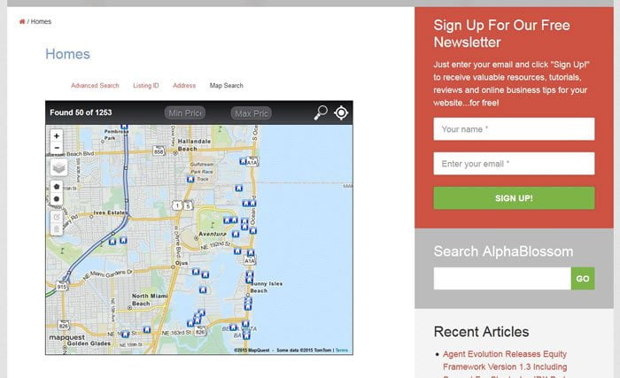
Here is a screenshot of the new map search page on a large sized desktop monitor:

Right away you can notice a much more modern, “Flat Design” style of the new Map Search template. They’ve also improved the filter button by changing the icon and adding the “Filter” label. This was confusing in the previous version since the icon may not be one that people recognize.
These aren’t the most impressive changes, though. The big changes come when you view this on smaller devices, like an iPad or iPhone. Here’s a screenshot as the screensize begins to reduce. You’ll notice that the map size reduces with it, and no longer does it overlap the sidebar. That’s because the map size is no longer a fixed width of 600px, but it’s percentage based and will adjust to fit its parent container.

As the screen size continues to shrink, the content area and sidebar become full-width, and the Map adjusts to fit the entire width of the screen:

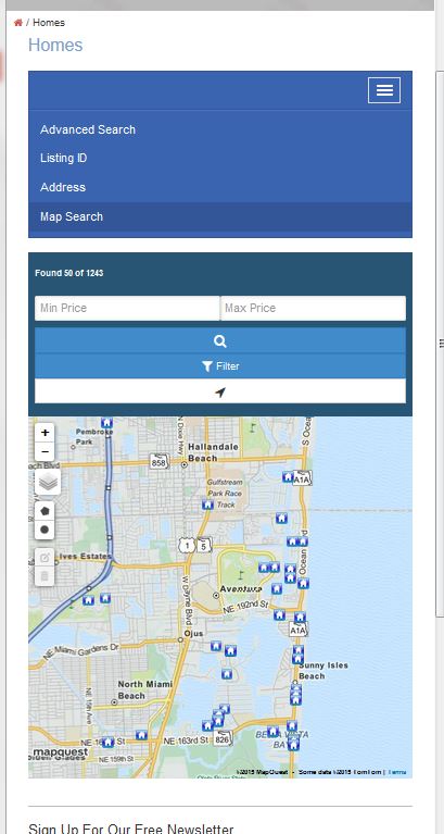
As we continue to shrink the browser, the Search options convert into a toggle menu to save on space, and the price fields and buttons now stack on top of each other. The map has also reduced its width to match the browser size and has refreshed to make sure the map is centered in the browser. Awesome!

Here’s a screenshot with the toggle menu open, showing the search options:

Switching to the new IDX Broker Mobile Responsive Map Template:
It’s very quick and easy to switch your website’s IDX Broker Map Search Page to use the new mobile responsive template. This is done through your IDX Broker admin panel.
Once you’ve logged in to your IDX Broker admin panel, select “Designs > Pages”. From there, you’ll see the pages listed on the left side. Go to the “Map Search” page title, and click on “Edit” under “Layout”. You can see it highlighted in this image:

That will bring you to a page to manage your Map Search templates. The top image shows the current template, along with an option to select which version (great if you have to revert to an earlier version because of a theme conflict). The lower two images are the two available template options:
- mobileFirstMapSearch – Currently only available version is 1.000
- mapsearch – Available versions 1.000, 1.001 and 1.002
To change to the new Mobile Responsive Map Search, just click the “Activate” button on the mobileFirstMapSearch.

The “Active” button will turn green indicating that is the active template. Clear your Wrapper Cache (“Design > Wrappers > Clear Wrapper Cache”) and that’s it. Your mobile responsive is now sporting a matching mobile responsive Map Search Page.
You may see some small issues which can be fixed easily with CSS, such as the price fields overlapping the ‘number of properties found’ text on certain widths. Also, depending on your theme, you may have some style conflicts which can also be easily fixed by adjusting your CSS styles.
Overall, this is a huge improvement to the map search page. It’s not perfect yet, but it’s a giant and very welcome improvement.

Leave a Reply